Text-to-Image
Interior Design
通用
Rules of Contrasting Colors: Brightness Matters
Prompt
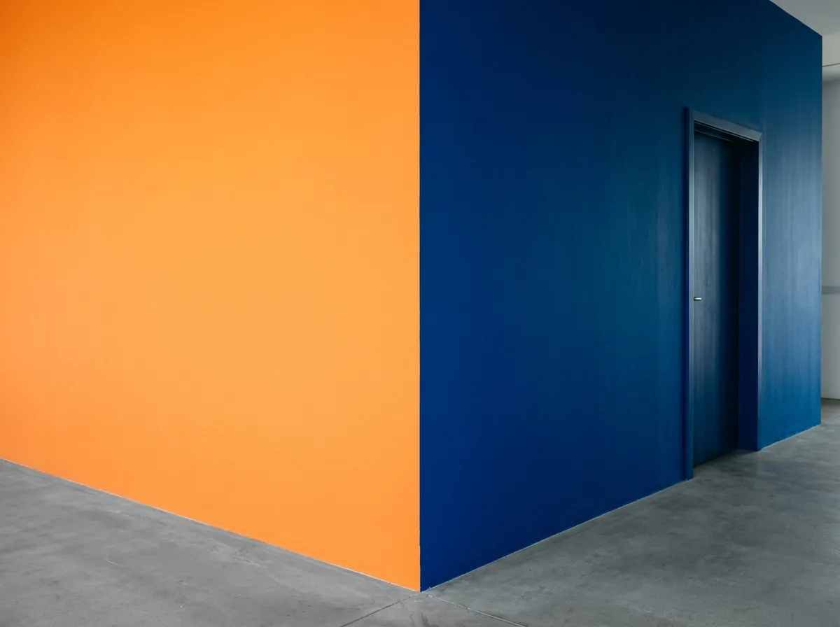
A set of high-chroma colors directly adjacent to each other. An orange wall is next to a blue wall, with no white line buffering between them; however, their lightness differs by two or three steps—orange is bright, blue is dark, so the boundary is clear rather than vibrating. Similar chroma but separated lightness is key for high-chroma juxtaposition to work. Avoid: having two adjacent colors with exactly the same lightness, using complementary colors with the same chroma and lightness, creating high-contrast color clashes in multiple places simultaneously, having gradients between color blocks.
Translated from Chinese by AI.
Show the original prompt
一組直接相接的高彩度顏色。一片橘色的牆旁邊是一片藍色,兩者中間沒有白線緩衝;但它們的明度差了兩三階——橘是亮的、藍是深的,因此交界處是清楚的而不是互相震動的。彩度接近但明度拉開,是高彩度並置能成立的關鍵。避免:讓兩個相接的顏色明度完全相同、使用彩度與明度都相同的互補色、在多處同時做高對比的撞色、讓色塊之間出現漸層。




