Text-to-Image
Interior Design
通用
Contemporary Version: Halve the Saturation
Prompt
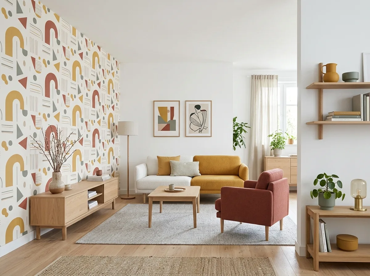
A contemporary version of a Nordic Pop interior. The structure is identical: white walls, light wood, one patterned surface, three colors. However, the saturation is reduced by half a step: mustard yellow becomes a softer ochre yellow, tomato red becomes brick red, and duck green becomes gray-green; the scale of the pattern is slightly reduced, and lines become thinner. The wood also changes from teak to lighter oak. The overall feel is therefore closer to contemporary home aesthetics, but the vocabulary remains unchanged. Avoid: reducing colors to complete desaturation, removing patterns to make the space a generic Nordic style, reducing saturation too much to become a Morandi palette, changing both structure and proportion simultaneously.
Translated from Chinese by AI.
Show the original prompt
一個當代版本的北歐普普室內。結構完全相同:白牆、淺木、一面圖案、三個顏色。但飽和度降了半階:芥末黃變成更柔和的赭黃、番茄紅變成磚紅、鴨綠變成灰綠;圖案的尺度略微縮小,線條變細。木材也從柚木換成較淺的橡木。整體因此更接近當代的居家感,但語彙沒有改變。避免:把顏色降到完全無彩度、拿掉圖案讓空間變成一般北歐風、把飽和度降太多變成莫蘭迪調、同時改變結構與比例。




