Text-to-Image
Interior Design
通用
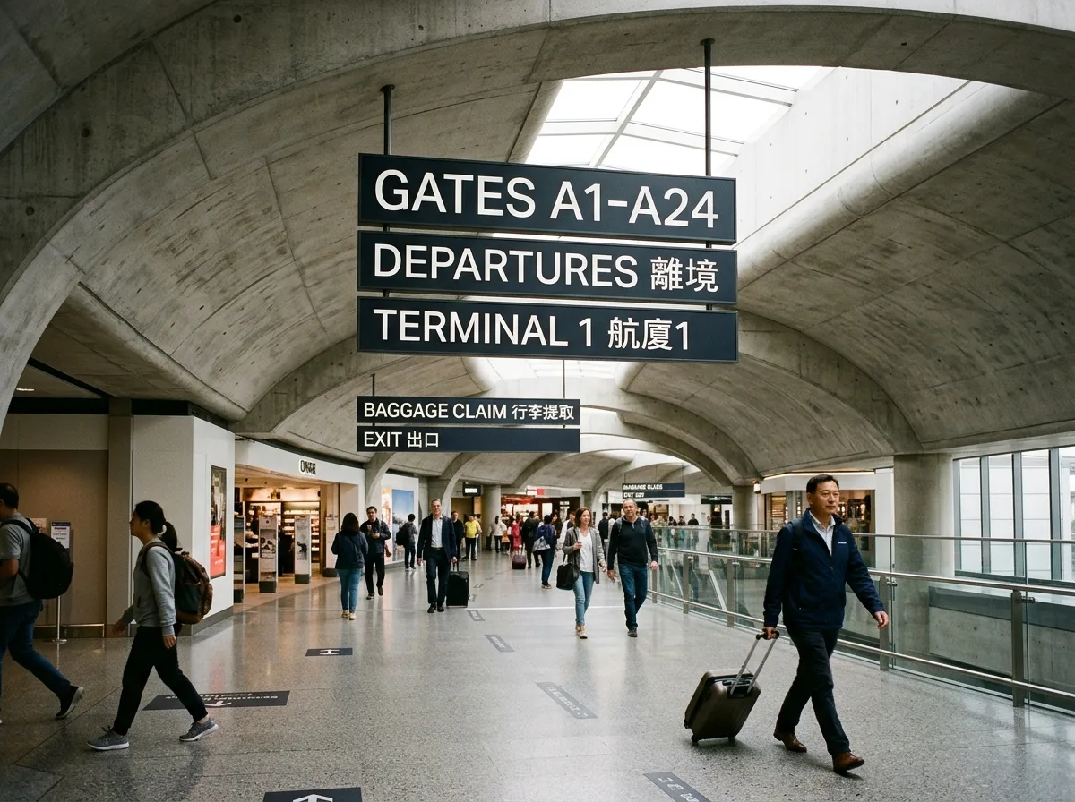
Charles de Gaulle Airport Signage: Typeface Designed for Oblique Angles and Long Distances
Prompt
A typeface born for airport signage: large apertures, open counters, and clearly cut stroke terminals ensure readability even when people are moving quickly, viewed from an oblique angle, and in mixed ambient light—these conditions, rather than aesthetics, determine the shape of the letters. Signage features white text on a dark background, suspended beneath curved concrete ceilings, positioned to align with passenger flow. Font sizes are graded into several levels based on viewing distance, not arbitrarily scaled to panel size. The beauty of the entire system comes from the honesty of its function. Wide-angle shot of the airport interior, with curved fair-faced concrete and suspended signage in the same frame, natural light falling from skylights. Avoid: typefaces with closed counters, decorative typefaces, signage not aligned with circulation direction, arbitrary font sizes.
Translated from Chinese by AI.
Show the original prompt
為機場標示而生的字體:開口大、字腔開放、筆畫末端切割清楚,確保在人快步移動、從斜側方、在混雜的環境光下仍然可讀——這些條件而非美學決定了字的形狀。標示為深底白字,懸掛在混凝土的曲面天花下方,位置與旅客的行進方向對齊。字級依觀看距離分成數級,不是隨板面大小任意縮放。整個系統的美感來自機能的誠實。機場室內廣角拍攝,清水混凝土的曲面與懸掛標示同框,自然光從天窗落下。避免:字腔封閉的字體、裝飾性字體、標示與動線方向不符、字級隨意。




