Text-to-Image
Interior Design
通用
No contrast between materials
Prompt
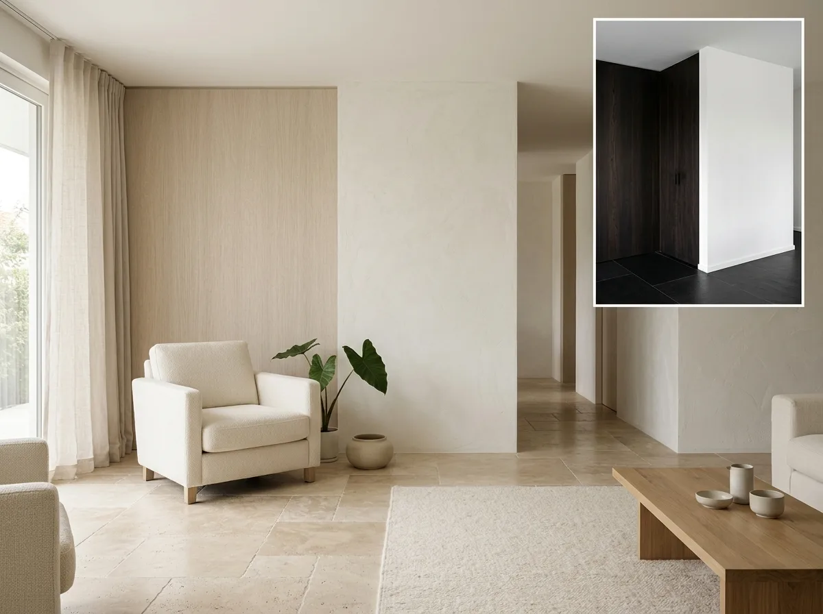
A space where materials are similar to each other. The colors and brightness of stone, wood, paint, and textiles are deliberately chosen to be very close—stone is warm beige, wood is light oatmeal, walls are off-white, fabric is ivory. When the four are placed together, the boundaries are almost invisible; one must rely on texture to distinguish where one material ends and another begins. This is contrary to common practice: most spaces use material contrast to create layers, whereas here it is deliberately erased. Thus, the space reads as a continuous whole rather than a collage of several materials. A corner of the image shows a high-contrast version for comparison: dark wood paired with white walls and black stone, where every boundary is a hard line. Avoid: making the two similar, using dark materials in the low-contrast version, having obvious lines appear at material boundaries, changing the space's configuration.
Translated from Chinese by AI.
Show the original prompt
一個材料彼此相近的空間。石材、木材、塗料與織品的顏色與明度刻意選得很接近——石是暖米、木是淺燕麥、牆是米白、布是象牙,四者放在一起時交界處幾乎看不出分界,必須靠質感才分辨得出哪裡換了材料。這與一般做法相反:大部分空間用材料的對比來製造層次,這裡則刻意抹掉。因此空間讀起來是一個連續的整體而不是幾個材料的拼貼。畫面一角以高對比的版本作對照:深木配白牆配黑石,每一道交界都是一條硬線。避免:讓兩者相似、在低對比版本使用深色材料、讓材料的交界出現明顯的線、改變空間的配置。




