Text-to-Image
Interior Design
通用
Washington Metro Signage: Minimalist Guidance Under Concrete Vaults
Prompt
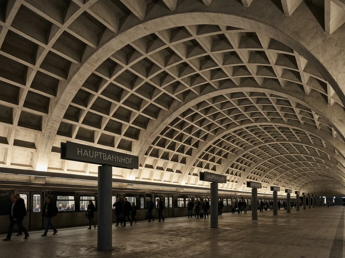
Washington Metro Signage: Minimalist guidance under concrete vaults.
In the massive grid-patterned concrete vaulted stations, signage must contend with the grand structure without competing: the solution is to compress all identification into a minimal set of elements—freestanding columnar station name signs next to the platform, with dark backgrounds, sans-serif uppercase, and a single weight, repeating at regular intervals. Station names float at a fixed height above eye level. Beyond this, the entire space contains no other text. The repetition of the structure and the repetition of the signage create two rhythms. Indirect lighting from the platform edge illuminates the vaults from below, while the signage emerges with its own low brightness. Wide-angle shot, with the vault grid and a row of station name signs in the frame simultaneously. Avoid: signage affixed to the vault, added advertisements, inconsistent font sizes, direct lighting on signage.
Translated from Chinese by AI.
Show the original prompt
在巨大的格子狀混凝土拱頂車站中,標示必須與宏偉的結構抗衡卻不能競爭:解法是把所有識別壓縮成極少的元素——月台旁獨立的柱式站名牌,深色底、無襯線大寫、單一字重,間隔規律地重複。站名以固定的高度浮在人的視線上方。除此之外,整個空間不再有任何文字。結構的重複與標示的重複形成兩種節奏。間接照明從月台邊緣打上拱頂,標示則以自身的低亮度浮現。廣角拍攝,拱頂的格子與一列站名牌同時入鏡。避免:標示貼在拱頂上、加裝廣告、字體大小不一、照明直射標示。




