Text-to-Image
Interior Design
通用
Saturated but Not Fluorescent
Prompt
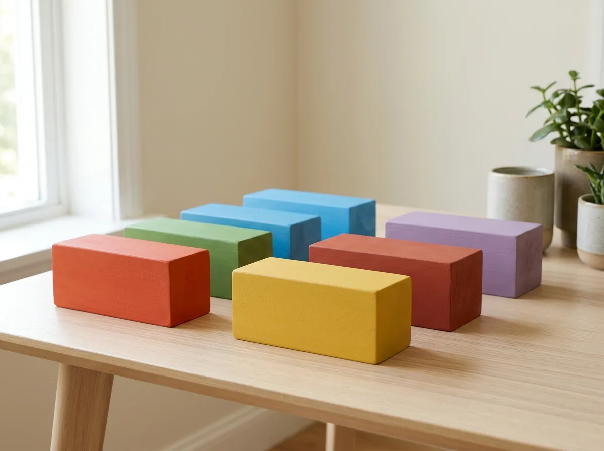
A set of clean, high-saturation colors that are not glaring. The colors are purely saturated but still within the range of natural colors: tomato orange instead of fluorescent orange, grass green instead of fluorescent green. They appear bright and pleasant in daylight and do not cause fatigue over long periods. The surface is matte or semi-gloss paint, not high-gloss plastic. Avoid: using fluorescent and neon colors, using high-gloss paint that reflects light harshly, making colors too dark and muddy, using special coatings that change color with light.
Translated from Chinese by AI.
Show the original prompt
一組乾淨而不刺眼的高彩度顏色。顏色是純粹飽和的,但仍在自然色的範圍內:番茄橘而不是螢光橘、草綠而不是螢光綠。它們在日光下看起來明亮愉快,長時間相處不會疲勞。表面是霧面或半光的塗料,不是高光的塑膠感。避免:使用螢光與霓虹色、使用高光烤漆讓顏色反光刺眼、把顏色調得過暗變成濁色、使用會隨光線變色的特殊塗料。




