Text-to-Image
Interior Design
通用
Muted tones: a little gray added to all colors
Prompt
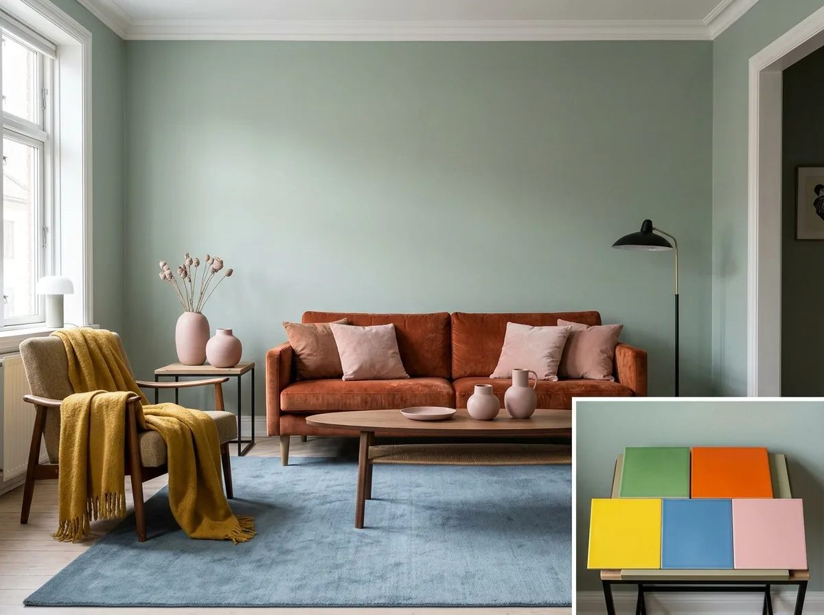
A space demonstrating the principle of muted tones. Five colors appear in the room—green, orange, yellow, blue, pink—but each has a large amount of gray added, so none of them are pure or vibrant: green is gray-green, orange is rust-orange, yellow is mustard, blue is gray-blue, pink is nude-pink. Their saturation all falls within a similar low range, and their lightness is also close. Because of this, the five colors can appear simultaneously in one space without clashing, instead forming a complex and mature harmony. A corner of the image presents a comparison: the same five colors but all high-saturation primary colors, resulting in a chaotic and cheap appearance. Avoid: making the two versions look similar, mixing a high-saturation color into the correct version, reducing the number of colors, changing the spatial layout.
Translated from Chinese by AI.
Show the original prompt
一個示範濁色調原則的空間。房間中出現五種顏色——綠、橘、黃、藍、粉——但每一種都被加入了大量的灰,因此沒有任何一色是純粹或鮮豔的:綠是灰綠、橘是鏽橘、黃是芥末、藍是灰藍、粉是裸粉。它們的彩度全部落在相近的低區間,明度也接近。因為如此,五種顏色可以同時出現在一個空間裡而不打架,反而形成一種複雜而成熟的和諧。畫面的一角以對照呈現:同樣的五色但全部是高彩度的原色,結果混亂而廉價。避免:讓兩個版本看起來相似、在正確版本混入一個高彩度的顏色、把顏色的數量減少、改變空間配置。




