Text-to-Image
Interior Design
通用
Wayfinding System: A Set of Typefaces from Lobby to Door
Prompt
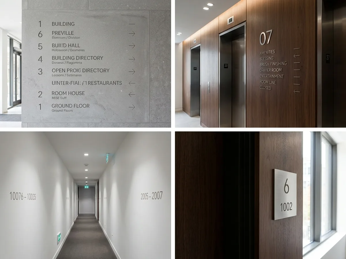
The entire building's signage uses a consistent design language: the same font, the same material, and the same installation method, from the lobby's floor directory, the elevator lobby's directional signs, the corridor's room number ranges, to the room door numbers. The scale decreases with distance but visually maintains a family resemblance. Materials are integrated with the wall surface – etching on stone, embedded metal on wood walls, backlighting on dark walls. Directional arrows are minimalist, avoiding stock-style icons. Emergency exit signs comply with regulations but use a discreet style that does not conflict with the overall design. Multilingual hierarchy is clear, with the primary language larger and secondary languages smaller. Photograph a set of signs and their corresponding wall surface during the day, showing material integration, font, and scale hierarchy simultaneously. Avoid: using different fonts and materials in different locations, signs being external plastic panels, arrows using cartoon icons, or multilingual text being the same size causing confusion.
Translated from Chinese by AI.
Show the original prompt
整棟建築的指標是同一套設計語言:同一種字體、同一種材質、同一種安裝方式,從大廳的樓層總覽、梯廳的分流指示、走廊的房號範圍到房門的號碼,尺度依距離遞減但視覺上是一家人。材質與所在牆面整合——石材上用蝕刻、木牆上用嵌入的金屬、深色牆面上用背光。方向的箭頭極簡,不使用圖庫式的圖示。緊急出口的標示依法規辦理但選用低調的款式,不與整體衝突。多語言的層級清楚,主要語言大、次要語言小。日間拍攝一組指標與其所在牆面,材質整合、字體與尺度層級同時可見。避免:各處使用不同字體與材質、指標為外掛塑膠板、箭頭使用卡通圖示、多語言同樣大小造成混亂。




