Text-to-Image
Interior Design
通用
Platform Station Names: Typography and Repetition on Tiled Walls
Prompt
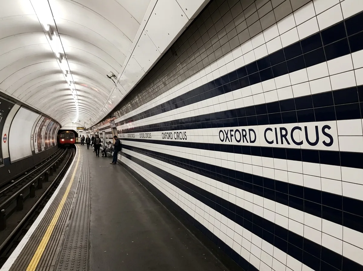
Station names appear repeatedly along the platform's tiled wall at fixed intervals, ensuring that passengers in any part of the train car can see it at least once—the placement of the signage is determined by the length of the car and the position of the doors, not by the aesthetic appeal of the wall. The typeface is embedded within the tile grid, with dimensions aligned to the tile module. The wall surface features horizontal bands of white and dark tiles, with the station name located on the dark band. The overall order comes from “repetition” rather than “the perfection of a single object.” Shot along the depth of the platform, with station names appearing continuously in perspective, and the arched tunnel walls receding. Avoid: station name appearing only once, typeface unrelated to tile module, advertisements covering station names, uneven lighting.
Translated from Chinese by AI.
Show the original prompt
站名以固定的間距沿著月台的磁磚牆重複出現,讓車廂內任何位置的乘客都能看見至少一次——標示的配置由車廂的長度與門的位置決定,而不是由牆的美觀決定。字體嵌在磁磚的網格中,尺寸與磚的模矩對齊。牆面為白色與深色磁磚的水平分帶,站名位於深色帶上。整體的秩序來自「重複」而非「單一物件的完美」。月台縱深方向拍攝,站名在透視中連續出現,拱形隧道壁面向後收束。避免:站名只出現一次、字與磚的模矩無關、廣告覆蓋站名、照明不均。




