Text-to-Image
Interior Design
通用
Stain-Resistant Colors: Oat, Taupe, and Charcoal
Prompt
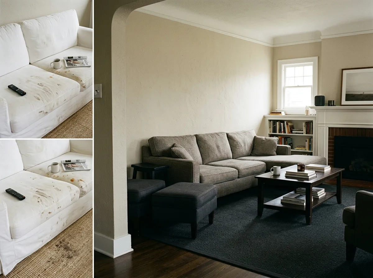
A space composed of dirt-resistant colors. All large-area soft furnishings avoid pure white and light colors, instead using three colors: oatmeal—a grayish beige where stains are not obvious; greige—a medium-light warm gray, the most durable shade; and deep charcoal—used in the most easily soiled areas such as rug edges and footstools. The lightness of these three colors is progressively distributed: walls are lightest, furniture is in the middle, and the floor is darkest, thus stabilizing the spatial重心. They are all low-saturation neutral colors, harmonious with each other. A corner of the image shows a comparison with a version featuring a pure white linen sofa and light-colored rug: under the same intensity of use, stains and marks are clearly visible. Avoid: making the two versions similar, using pure white and light colors in the dirt-resistant version, adding high-saturation colors, inverting the lightness distribution of the colors.
Translated from Chinese by AI.
Show the original prompt
一個以耐髒色系構成的空間。所有的大面積軟裝都避開純白與淺色,改用三種顏色:燕麥——帶灰的米,污漬不明顯;灰褐——中明度的暖灰,是最耐用的一階;深炭——用在最容易髒的地方如地毯的邊緣與腳凳。這三色的明度依序遞增地分佈:牆面最淺、家具中間、地面最深,因此空間的重心穩定。它們都是低彩度的中性色,彼此和諧。畫面一角以純白亞麻沙發與淺色地毯的版本作對照:同樣的使用強度下,污漬與痕跡清楚可見。避免:讓兩者相似、在耐髒版本使用純白與淺色、加入高彩度的顏色、把顏色的明度分佈顛倒。




