Text-to-Image
Interior Design
通用
The Color of Medical Spaces: Moving Beyond Green
Prompt
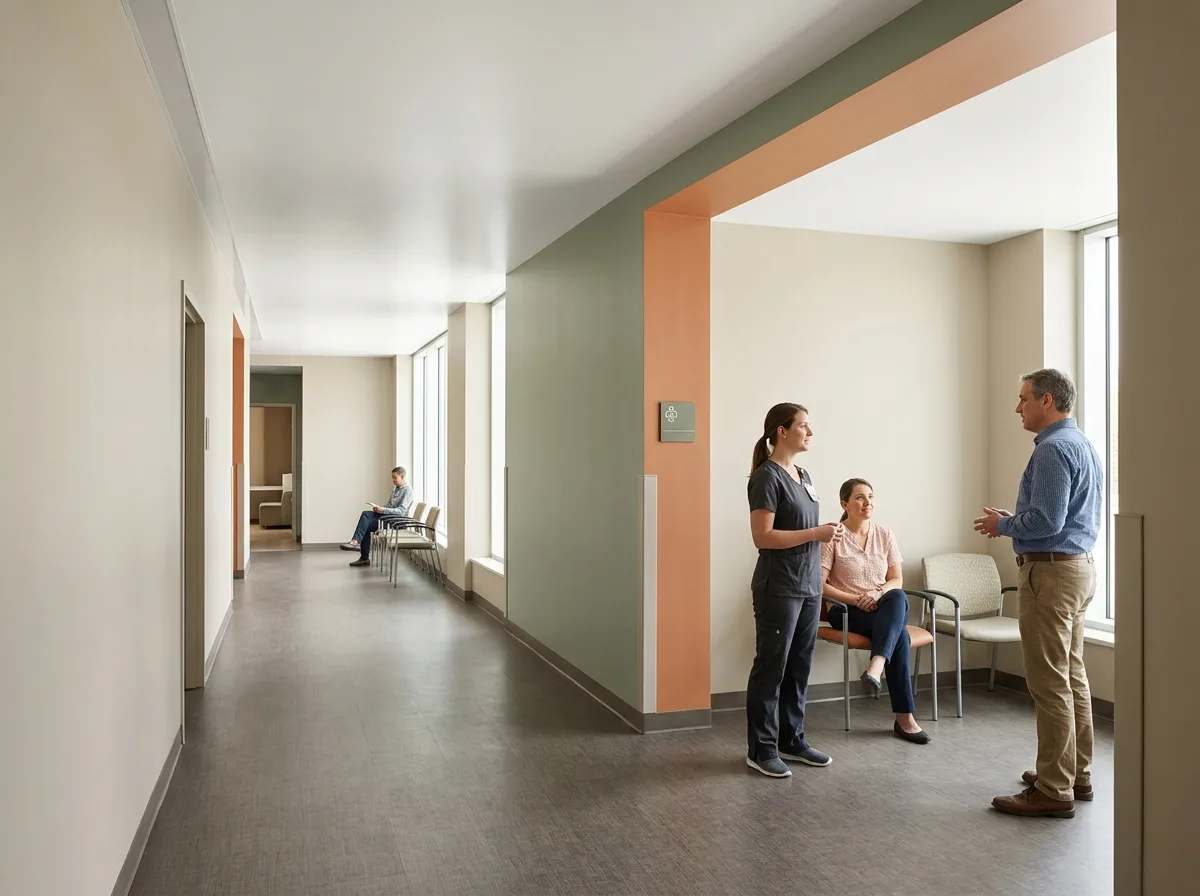
Colors in Medical Spaces: Move Away from That Green
The colors in medical spaces are not decoration but tools: walls use low-chroma warm neutral colors to make skin tones appear normal (this directly affects doctors' judgment); higher-chroma colors are used to mark areas and directions to aid memory; avoid large areas of cool greens and cool blues, those colors institutionalized for decades. The luminance difference between the ceiling and floor should be sufficient to clearly define the upper and lower boundaries of the space. The distribution of colors should be layered: large areas quiet, local areas intense, rather than the entire floor painted the same pastel color. Daytime shot under natural light, with the layering of colors and natural restoration of skin tones simultaneously visible. Avoid: Large areas of cool green or cool blue, entire floor in the same color, all colors highly saturated, no luminance difference between ceiling and floor.
Translated from Chinese by AI.
Show the original prompt
醫療空間的色彩不是裝飾而是工具:牆面用低彩度的暖中性色讓膚色看起來正常(這會直接影響醫師的判斷)、用彩度較高的顏色標記區域與方向幫助記憶、避免大面積的冷綠與冷藍那些被制度化了幾十年的顏色。天花與地坪的明度差要足夠,讓空間的上下界線清楚。色彩的分布應該有層次:大面積安靜、局部強烈,而不是整層樓刷成同一個粉色。日間自然光下拍攝,色彩的層次與膚色的自然還原同時可見。避免:大面積冷綠或冷藍、整層同一顏色、彩度全部拉高、天地色彩無明度差。




