Text-to-Image
Interior Design
通用
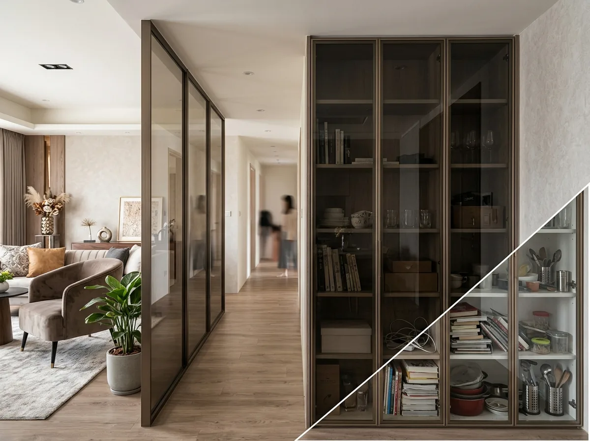
Gray Glass: The Step Up from Clear Glass
Prompt
A set of partitions and cabinet doors using gray glass. The glass is tinted gray or tea-colored, making objects viewed through it appear darker in color and softer in outline, so items inside the cabinet, even if not perfectly organized, will not look cluttered; when gray glass is used for partitions, the two spaces are both connected and separated. The glass frame is slender black titanium or champagne gold, with a cross-section of only two centimeters. A corner of the image shows a comparison with a clear glass version: every item inside the cabinet is fully exposed, and any slight disarray is magnified; the partition also loses its layering. Both versions have the same frame material and configuration. Avoid: making the two versions similar, using black glass that is too dark and loses transparency, making the frame thick and bulky, or adding decorative film to the gray glass.
Translated from Chinese by AI.
Show the original prompt
一組使用灰玻的隔間與櫃門。玻璃是帶灰或帶茶色的,透過它看見的東西顏色變深、輪廓變柔,因此櫃內的物品即使沒有整理得完美也不會顯得雜亂;隔間用灰玻時,兩個空間既相通又有分隔。玻璃的框是細窄的黑鈦或香檳金,斷面僅兩公分。畫面一角以清玻的版本作對照:櫃內的每一樣東西都一覽無遺,任何一點不整齊都被放大;隔間也失去了層次。兩者的框料與配置相同。避免:讓兩者相似、使用顏色過深的黑玻失去通透、把框做得粗厚、在灰玻上加裝飾貼膜。




