Text-to-Image
Architecture
通用
Station Architecture and Signage Integration: Volume, Openings, and Markings in a Unified Language
Prompt
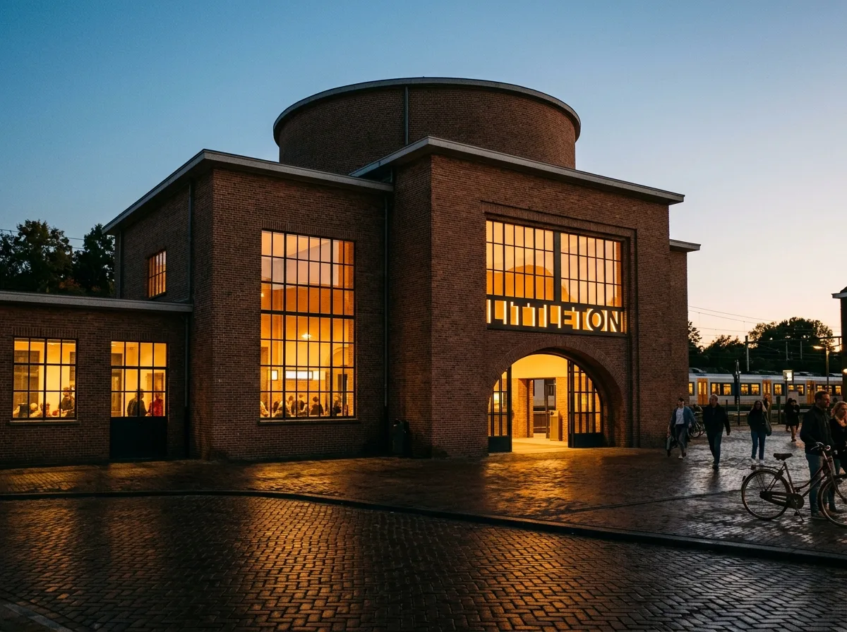
Design signage and architecture as one: the station is a concise brick geometric volume, with circular or square drum-shaped blocks and large windows. Identification marks are not hung, but embedded in specific positions on the facade—usually above the center of the main opening, with dimensions proportional to the opening width. At night, light from inside the building illuminates the street through large windows, and the marks become silhouettes or luminous bodies against the light. The brick color, window divisions, and mark proportions are determined by the same set of rules. This is an early example of “the building itself is the sign.” Shot from a street diagonal at dusk, with the volume, openings, and marks in the same frame. Avoid: signs added afterwards, unrelated to opening proportions, architectural language and sign language disconnected.
Translated from Chinese by AI.
Show the original prompt
把標示與建築當成同一件事來設計:車站為簡潔的磚砌幾何量體,圓形或方形的鼓狀體塊,大面開窗。識別標記不是掛上去的,而是嵌在立面的特定位置——通常置於主要開口的上方中央,尺寸與開口寬度成比例。夜間,建築內部的光透過大窗照亮街道,標記在光的襯托下成為剪影或發光體。磚的顏色、窗的分割與標記的比例是同一套決定。這是「建築本身就是招牌」的早期典範。黃昏時從街道斜角拍攝,量體、開口與標記同框。避免:標記事後加掛、與開口比例無關、建築語言與標記語言脫節。