Text-to-Image
Interior Design
通用
Ochre and Olive Green: Two Earth Tones
Prompt
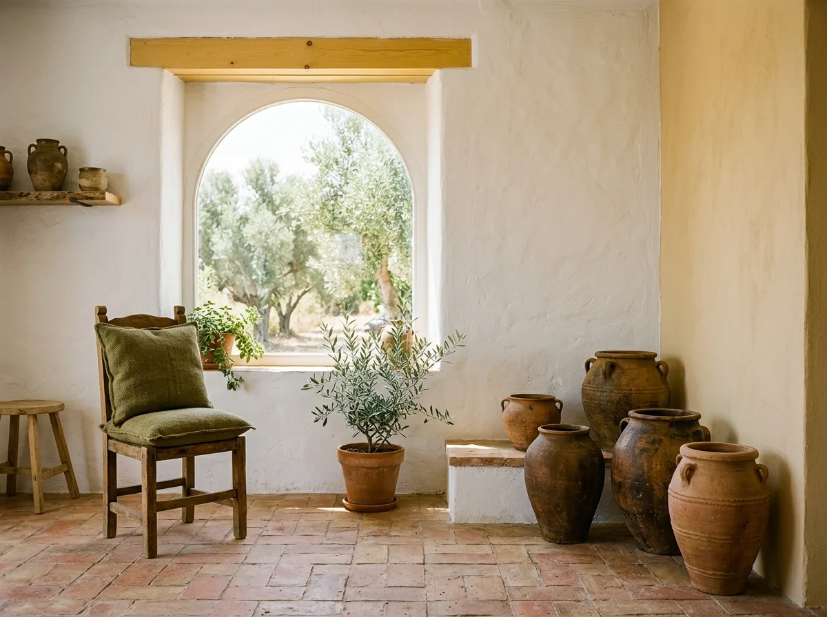
A space composed of earth colors. Ochre comes from the materials themselves: the orange-red of terracotta floor tiles, the deep ochre of handmade ceramic pots, and a lime wall painted a light ochre. Olive green comes from plants and a few textiles: the leaves of olive trees outside the window, the foliage of a few indoor potted plants, and an olive green coarse cotton throw pillow. Both colors are low-saturation and slightly grayed; they are complementary but, due to their low saturation, do not clash, instead resembling two elements from the same land. White lime walls occupy most of the area as a background. Wood is a warm light yellow. Strong sunlight makes these colors appear dry. Avoid: using high-saturation orange and green, allowing the two colors to cover more area than white, adding blue and other colors, using cool-toned lighting.
Translated from Chinese by AI.
Show the original prompt
一個以土地顏色構成的空間。赭土色來自材料本身:赤陶地磚的橘紅、手工陶罐的深赭、與一面刷成淡赭土色的石灰牆。橄欖綠來自植物與少數的織品:窗外的橄欖樹葉、室內幾株盆栽的葉色、以及一條橄欖綠的粗棉抱枕。兩種顏色都是低彩度的,而且都帶有灰;它們互為補色但因為彩度低而不衝突,反而像同一片土地上的兩種東西。白色的石灰牆佔了大部分面積作為背景。木材是溫暖的淺黃。強烈的陽光讓這些顏色都顯得乾燥。避免:使用高彩度的橘與綠、讓兩色的面積超過白色、加入藍與其他顏色、使用冷色調的照明。




