Text-to-Image
Architecture
通用
Public Theater: Typography as Identity, Compressed and Oblique
Prompt
Public Theater: Typography as Identity, Compressed and Tilted Layout
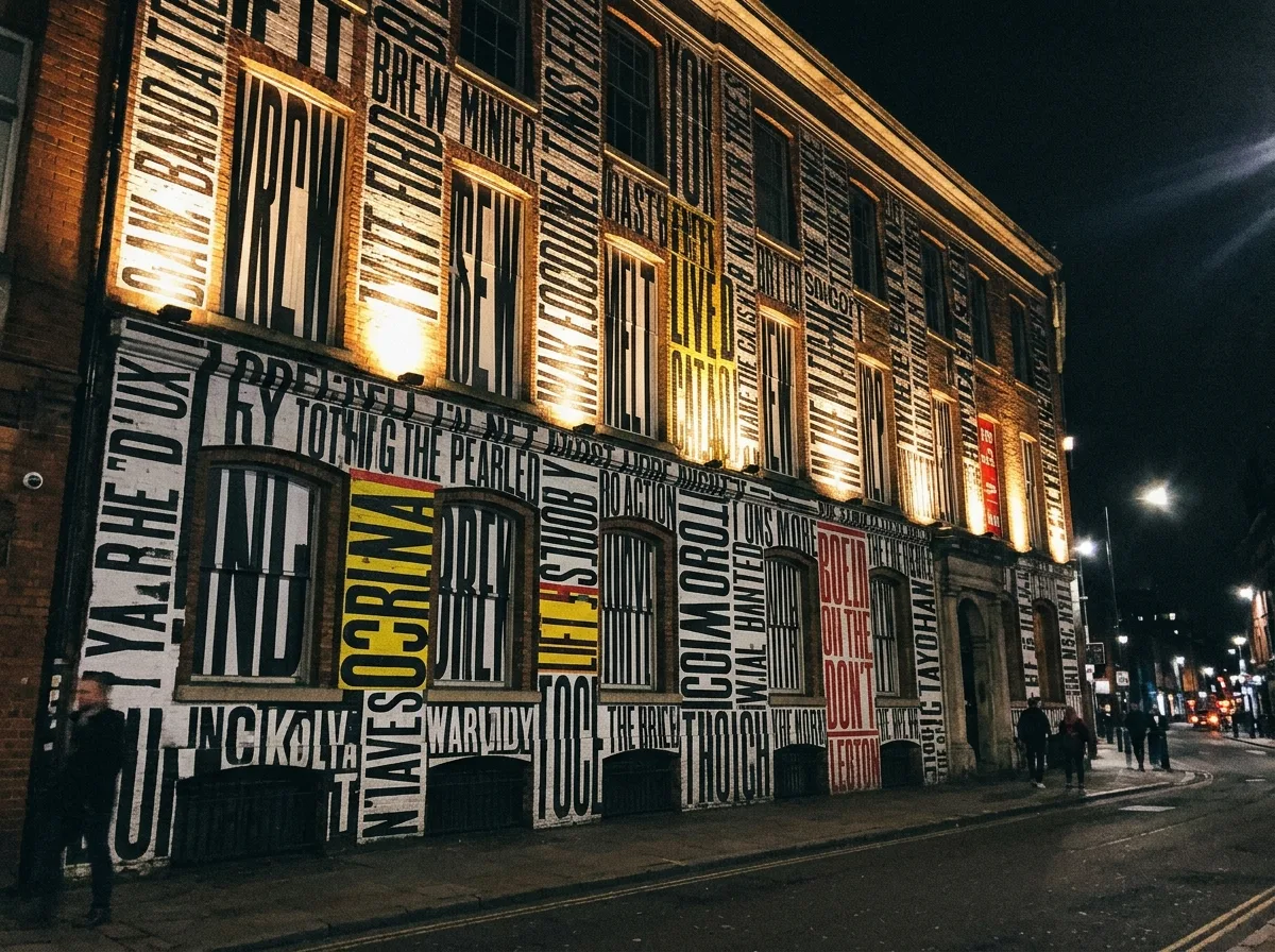
No graphic marks are used; identity is entirely carried by typography: heavy, woodcut-style typefaces are compressed, stretched, tilted, and stacked in layers, filling the entire layout with almost no blank space. The direction of the letters is not uniform, some vertical, some tilted, creating an energy reminiscent of street posters. The color scheme is black, white, and a single vibrant color (often bright yellow or red). This language extends from printed materials to the building facade: large letters directly cover the classical brick building facade, the conflict between old and new being the effect. Night shot, letters on the facade illuminated by spotlights, overlapping with the brick texture. Avoid: using graphic logos, excessive white space, slender typefaces, neat and symmetrical arrangement.
Translated from Chinese by AI.
Show the original prompt
不使用任何圖形標記,識別完全由排印承擔:粗重的木刻風格字體被壓縮、拉伸、傾斜並層層堆疊,填滿整個版面幾乎不留空白。字的方向不統一,有些垂直、有些傾斜,製造出街頭海報般的能量。配色為黑、白與單一鮮豔色(常為亮黃或紅)。這套語言從印刷品延伸到建築立面:大型的字直接覆蓋在古典磚造建築的立面上,新舊之間的衝突就是效果。夜間拍攝,立面上的字被投光照亮,與磚的紋理疊合。避免:使用圖形 logo、留白過多、字體纖細、排列整齊對稱。