Text-to-Image
Interior Design
通用
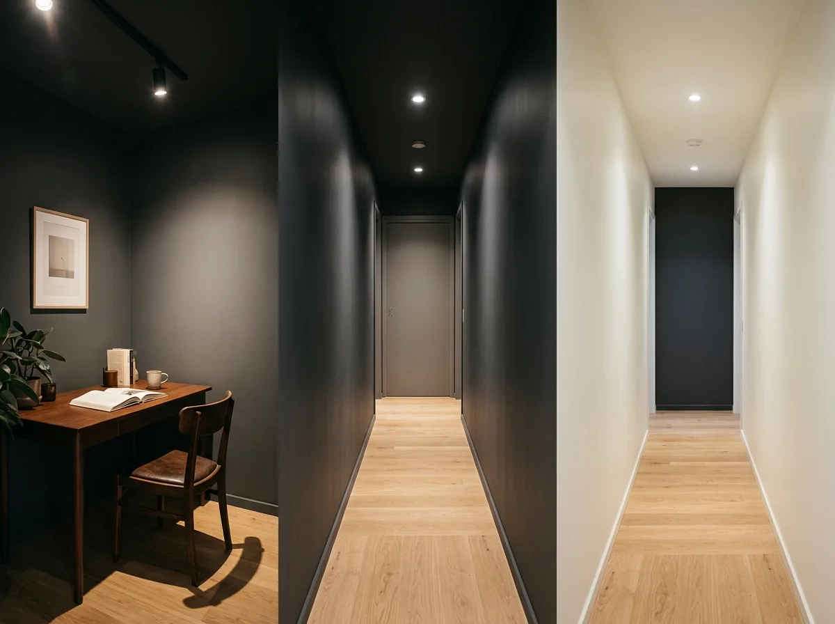
Dark colors and square footage: small spaces can be dark, but not long and narrow ones
Prompt
A comparison of the results of using dark colors in two types of small spaces. On the left is a square small room: dark colors blur the boundaries, making it less obvious how small the room is, and with layered accent lighting, it appears deep rather than cramped. On the right is a narrow, long space: the same dark colors make the two side walls feel closer, emphasizing the length, making it feel like a tunnel when walked into, with obvious pressure. Therefore, dark colors are suitable for square small spaces but not for narrow, long ones. If a narrow, long space must use dark colors, the approach is to only darken the short end wall, keeping the two long sides light. The image should present a comparison of these three states. Avoid: making the effects of both look the same, depicting a narrow, long space fully painted dark as comfortable, changing the lighting configuration of both, ignoring the third corrective solution.
Translated from Chinese by AI.
Show the original prompt
兩種小空間使用深色的結果對照。左側是方正的小房間:深色讓邊界模糊,反而看不出房間有多小,加上重點光的層次,顯得有深度而不侷促。右側是窄長的空間:同樣的深色讓兩側的牆更逼近,長度被強調,走進去像一條隧道,壓迫感明顯。因此深色適合方正的小空間而不適合窄長的。如果窄長空間非用深色不可,做法是只深其中的短邊那一面,兩側維持淺色。畫面呈現這三種狀態的比較。避免:讓兩者的效果看起來相同、在窄長空間全刷深色卻畫得舒適、改變兩者的照明配置、忽略第三種修正方案。




