Text-to-Image
Interior Design
通用
No black: the deepest color is just dark beige
Prompt
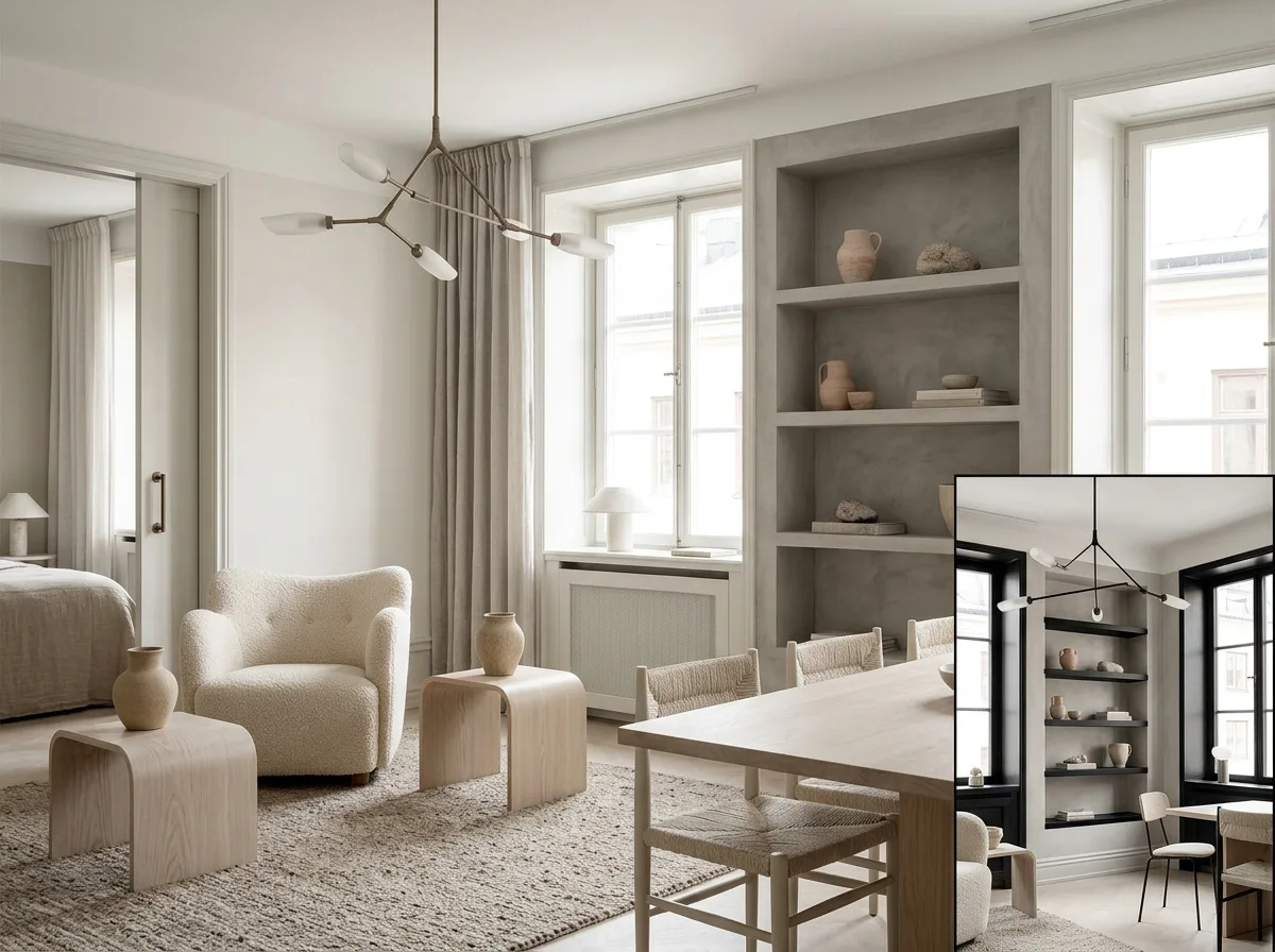
A space that uses absolutely no black. All areas requiring visual weight use deep beige, grayish-brown, or cocoa instead of black: hardware is matte bronze instead of black iron, lamp stands are beige-gray instead of black, furniture legs are wood-colored, and the shadows of lines and gaps are warm gray instead of pure black. Because there is no black point, there is no strongest contrast point in the image, and the eye is not fixated anywhere. This is the most easily recognizable difference between soft minimalism and typical minimalism—the latter often uses thin black lines for finishing and accentuation. A corner of the image shows a version with black details added for comparison; those few black lines immediately dominate the entire image. Avoid: making the two similar, adding any pure black elements to the no-black version, using colors so dark they approach black, changing materials and configuration.
Translated from Chinese by AI.
Show the original prompt
一個完全不使用黑色的空間。所有需要視覺重量的地方都用深米、灰褐或可可色取代黑:五金是霧面的古銅而不是黑鐵、燈具的支架是米灰而不是黑色、家具的腳是木色、線條與縫隙的陰影是暖灰而不是純黑。因為沒有任何一點是黑的,畫面中不存在最強的對比點,眼睛沒有被釘住的地方。這是柔和極簡與一般極簡最容易辨認的差別——後者常用黑色細線來收邊與提神。畫面一角以加入黑色細節的版本作對照,那幾條黑線立刻主導整個畫面。避免:讓兩者相似、在無黑版本加入任何純黑的元素、使用深到接近黑的顏色、改變材料與配置。




