Text-to-Image
Interior Design
通用
Morandi • Living Room: Layers of a Gray Color Palette
Prompt
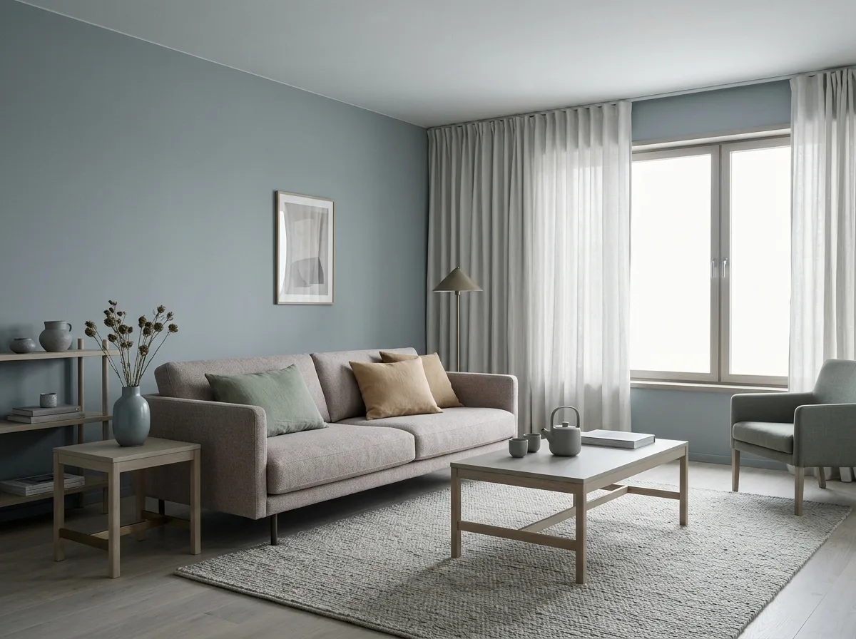
A Morandi-colored living room: all colors have grey added, saturation is very low but distinct hues remain – the walls are misty blue-grey, the sofa is grey-pink, the throw pillows are sage green and light ochre respectively, and the rug is grey-beige. Because the lightness of each color is similar, the entire space appears soft and flat, with no single element standing out. Woodwork is light grey oak stain. Metal elements are matte antique brass. Curtains are a matching grey-white. The light is soft and even, creating no strong shadows. The overall effect is like a low-saturation still life painting. Avoid: using high-saturation or pure colors, excessive lightness difference between colors, adding glossy reflective materials, strong directional lighting.
Translated from Chinese by AI.
Show the original prompt
一間莫蘭迪色系的客廳:所有的顏色都被加了灰,飽和度壓得很低但仍有明確的色相——牆面是霧霾藍灰,沙發是灰粉,抱枕分別是鼠尾草綠與淺赭,地毯是灰米。因為每個顏色的明度接近,整個空間顯得柔和而扁平,沒有任何一處跳出來。木作是淺灰的橡木染色。金屬件是霧面的古銅色。窗簾是同色系的灰白。光線柔和而均勻,不製造強烈的陰影。整體像一幅低彩度的靜物畫。避免:使用高彩度或純色、顏色之間明度差異過大、加入亮面反光材質、光線做成強烈的方向光。




