Text-to-Image
Interior Design
通用
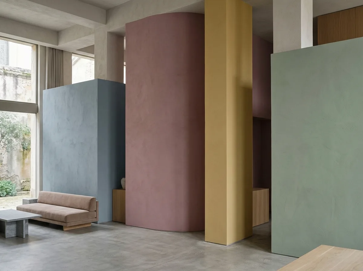
Reduced saturation: pink needs gray added
Prompt
A set of desaturated colors. Pink is dusty rose with added gray, yellow is earthy yellow not lemon yellow, blue is grayish-blue not sky blue, green is grayish-green not grass green. Each color looks like half gray has been mixed into the original candy color, with high lightness but appearing subdued. They will not be harsh when applied to large volumes. Avoid: high-saturation candy colors and fluorescent colors, colors so bright they reflect, pure white and pure black, placing multiple high-saturation colors in the same frame.
Translated from Chinese by AI.
Show the original prompt
一組彩度被壓下來的顏色。粉紅是加了灰的藕粉、黃是土黃不是檸檬黃、藍是灰藍不是天藍、綠是灰綠不是草綠。每一個顏色都像在原本的糖果色裡兌了一半的灰,明度偏高但看起來是沉的。它們鋪在大面積的量體上不會刺眼。避免:使用高彩度的糖果色與螢光色、讓顏色亮到反光、使用純白與純黑、把多個高彩度的顏色放在同一個畫面。




