Text-to-Image
Interior Design
通用
Wayfinding Without Signs: Using Light, Color, and Form to Navigate
Prompt
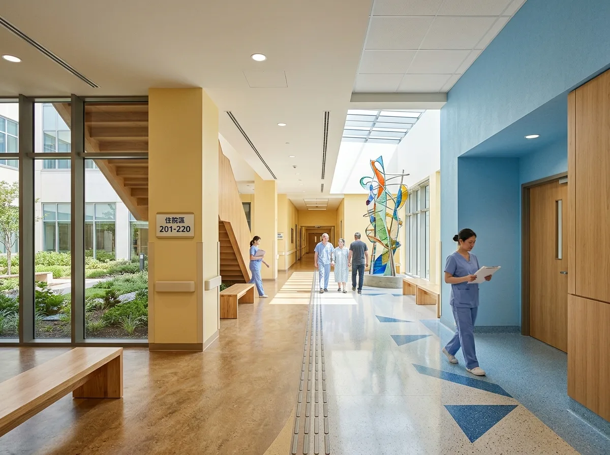
Hospitals covered in signs are usually evidence of spatial failure. A legible space relies on three things: each area having its own color or material for people to remember it as "the blue zone"; natural light and identifiable landmarks (atrium, artwork, stairs) at regular intervals along main circulation paths; and the floor plan itself being simple enough to describe verbally. Signage serves only as a final confirmation, not the sole basis. Font size and contrast should be designed for those with impaired vision, and placed at eye level. Photograph from the corridor, showing color zoning and light landmarks simultaneously, with a minimal number of signs. Avoid: walls covered in signs and arrows, identical colors in all areas, circulation paths without natural light and landmarks, overly complex floor plans.
Translated from Chinese by AI.
Show the original prompt
醫院裡貼滿標示牌通常是空間本身失敗的證據。可讀的空間靠三件事:每個區域有自己的顏色或材質讓人以「藍色那一區」記憶、主要動線上每隔一段就有自然光與可辨識的地標(中庭、藝術品、樓梯)、以及平面本身的邏輯簡單到可以口述。標示只做最後的確認,而不是唯一的依據。字級與對比要為視力退化者設計,位置降到視線高度。從走道拍攝,顏色分區與光的地標同時可見,標示牌數量極少。避免:牆面貼滿標示與箭頭、各區顏色相同、動線無自然光與地標、平面過於複雜。




