Text-to-Image
Interior Design
通用
Nordic Contemporary Brands | Low Saturation Palettes and Affordability
Prompt
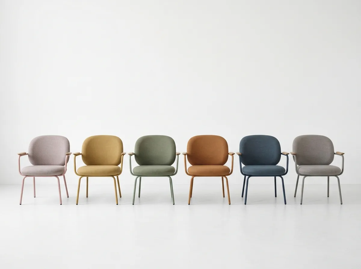
A set of contemporary Nordic brand furniture, differing from its 20th-century predecessors in that: materials mix steel, plastic, veneer, and fabric instead of insisting on solid wood, making the price affordable; shapes are rounder, softer, and proportions are lower; colors are the most distinctive identifier of this type of brand—a complete palette of low-chroma but uniformly saturated colors, like dusty pink, mustard, sage green, ochre, and dark blue, where any two colors placed together do not clash. The image shows six different colors of the same chair arranged in a row. Pure white background, even studio lighting.
Avoid: Using high-chroma primary colors, inconsistent saturation among the six chair colors, sharp-angled shapes, using only solid wood materials.
Translated from Chinese by AI.
Show the original prompt
一組當代北歐品牌的家具,與二十世紀的前輩不同之處在於:材料混用鋼、塑料、貼皮與織品而不堅持全實木,價格因此親民;造型更圓、更軟、比例更矮;顏色是這類品牌最鮮明的識別——一整套低彩度但飽和度統一的色票,像灰粉、芥末、鼠尾草綠、赭土、暗藍,任兩色放在一起都不衝突。畫面呈現同一款椅子的六種顏色排成一列。純白背景,均勻的攝影棚光。避免:使用高彩度的原色、六張顏色的飽和度不一致、造型做成銳角、材料只用實木。




