Text-to-Image
Architecture
通用
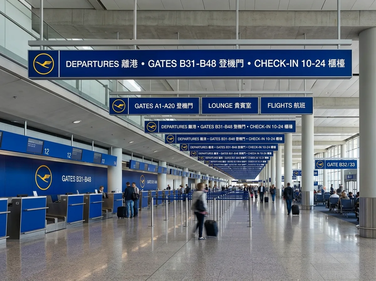
Lufthansa Identity: Crane Symbol and Systematized Airport Signage
Prompt
Designing airport signage for an airline brand with the systematic thinking of the Ulm School: a highly simplified crane-shaped mark placed within a circle, along with only sans-serif text and two colors—dark blue and yellow. The size, position, and surrounding white space of the mark are determined by a strict set of rules, appearing with the same proportion on counter back walls, signboards, boarding gates, and aircraft bodies. Signboards are elongated, dark blue with white text, suspended from the airport ceiling. The power of the system comes from "being the same wherever it appears," rather than the extravagance of a single object. Interior wide-angle shot of the airport, with continuous signage repeating in perspective. Avoid: distorted marks or added shadows, adding a third color, mixed typefaces, or inconsistent signboard sizes.
Translated from Chinese by AI.
Show the original prompt
以烏爾姆學派的系統思維設計航空品牌的機場標示:一個高度簡化的鶴形標記置於圓形之中,除此之外只有無襯線字與兩個顏色——深藍與黃。標記的大小、位置與周圍留白由一套嚴格的規範決定,在櫃檯背牆、指示牌、登機門與機身上以同樣的比例出現。標示板為長條形,深藍底配白字,懸掛於機場天花下。系統的力量來自「無論在哪裡出現都一樣」,而非單一物件的華麗。機場室內廣角拍攝,連續的標示在透視中重複。避免:標記變形或加陰影、增加第三個顏色、字體混用、標示板大小不一。