Text-to-Image
Interior Design
通用
ERCO Identity: The Lighting Brand Takes "Light" as its Identity
Prompt
ERCO Identity: Lighting brand uses "light" as its identity.
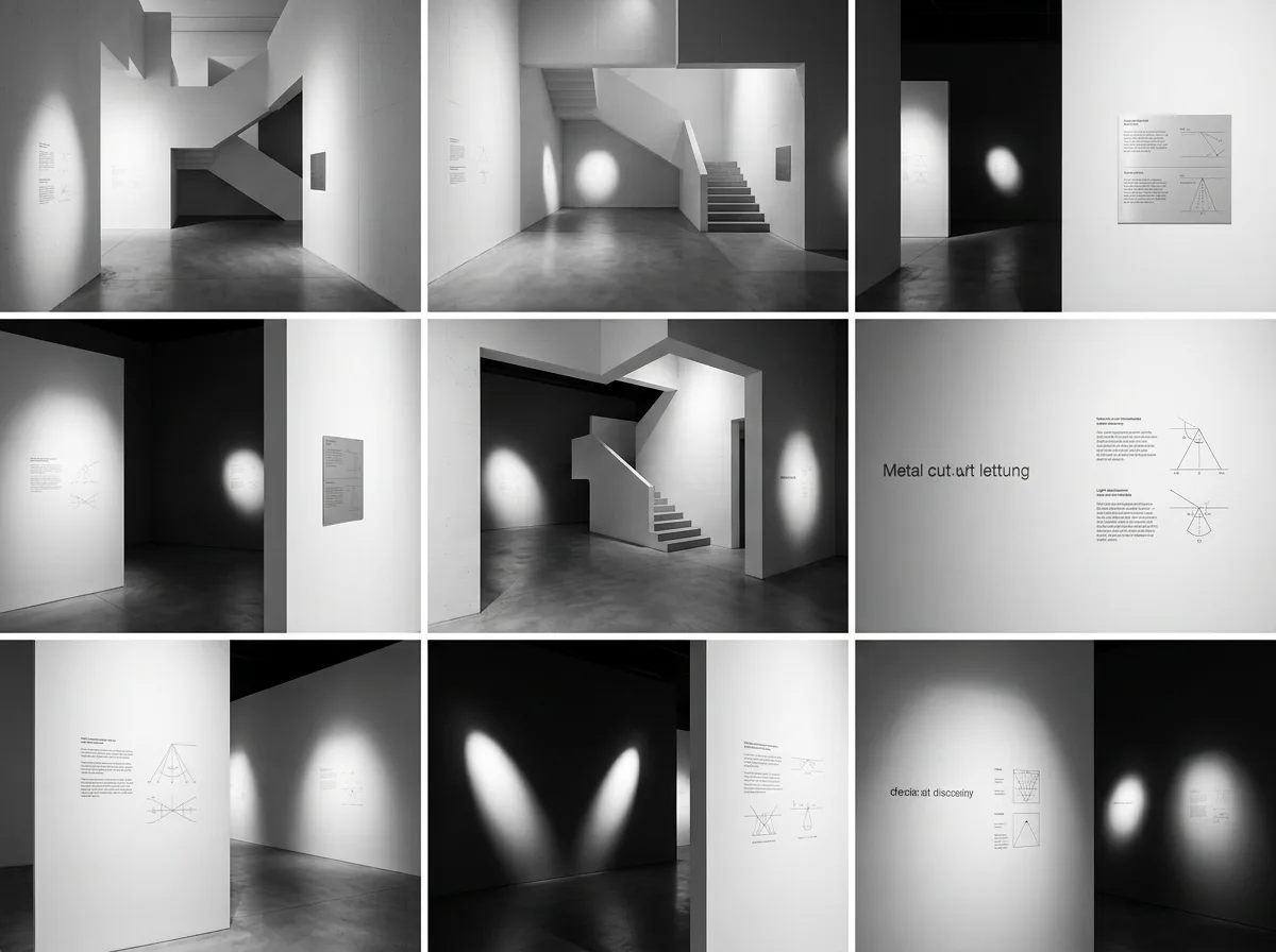
Handle the signage for a display space using the design language established by Aicher for ERCO: the brand does not sell light fixtures but sells light, so the signage itself recedes to a minimum—extremely small sans-serif text, single weight, abundant white space, with the true protagonist being the precisely controlled light spots on the wall. The line thickness of the typeface and diagrams is consistent, and technical icons depict light angles and distribution with the fewest possible lines. The space features white walls and gray floors, with all identification presented as engravings or extremely thin metal letters, non-illuminated. Optical precision and typographic restraint are two facets of the same attitude. Inside the exhibition space, narrow-angle projected light forms clearly defined light spots, with signage located in the dark areas outside the light spots. Avoid: illuminated signs, multiple fonts, decorative graphics, blurry light spot edges.
Translated from Chinese by AI.
Show the original prompt
以艾舍為 ERCO 建立的設計語言處理展示空間的標示:品牌不販售燈具而是販售光,因此標示本身盡量退到最低——極小的無襯線字、單一字重、大量留白,真正的主角是牆上被精確控制的光斑。字體與圖表的線條粗細一致,技術圖示以最少的線描繪光的角度與分布。空間為白牆、灰地,所有識別以雕刻或極薄的金屬字呈現,不發光。光學的精確與排印的克制是同一種態度。展場內以窄角投射光形成清楚邊界的光斑,標示位於光斑之外的暗處。避免:發光招牌、多種字體、裝飾性圖形、光斑邊緣模糊。




